
m-mulan
Project live at
https://mmulan.com
*Still developing now
Duration
3 months for design
Team
UX/UI Designer
Web Developer (Samantha Ming)
Overview
Making an E-commerce website(Shopify).
The m-mulan runs a tea class and is a tea expert with many students. The m-mulan will launch the website to sell tea online using Shopify, while they’re preparing the company to be a SAAS for tea.
Goals
- Based on the free theme’s components of Shopify make a design for the developer can customize.
- To get an order with a tea subscription from Canada/US.
- Not only sell teas but also sell their own service that to convey the client’s thoughts, personality, and way of thinking.
Problem
How do we give users trust and drive buying motivation?
Challenge
The client and a developer made the structure of the E-commerce website, but it wasn’t fit their taste. Because they didn’t make research to know the industry and didn’t know how can you approach their service.
The client’s company originated in Taiwan, they would like to create an atmosphere that directs an Asian style rather than a European style.
Due to the client’s budget and site management, it was difficult to produce multiple pages. Also, on a specific platform called Shopify, the scratch began with the limited that based components of the free theme “Dawn” to make it easy to customize.
Research
Understand the market
Researched other players who sell tea subscriptions same as a client in the tea market. I started comparing to understand the structures of the website, the targeting, and the price range. Among them, only one out of 10 competition sites focused on the client’s intention to “communicate the seller’s thoughts, personality, and way of thinking.” I thought it would be a good strategy if the design focused on showing more personality.
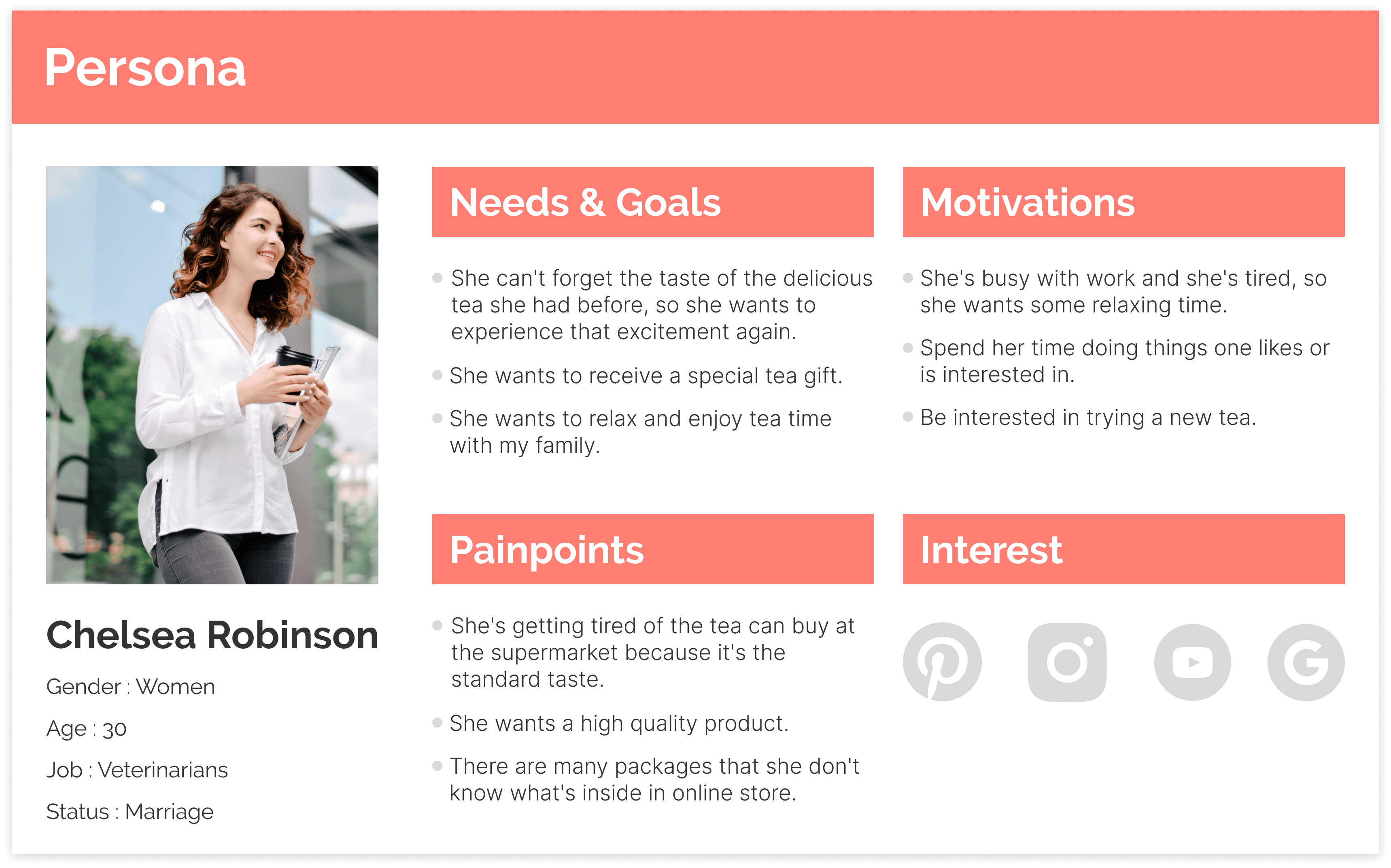
Conducted user interviews with the target “Female users who like tea” using existing competitive websites. I asked questions about “Why?” to uncover users’ needs.
Participants
4 people (Female, 28-40 years old)
Live in Canada and the US
How
One-on-one sessions in person
Through user feedback and design evaluation by UX heuristic from the UX perspective, I will understand what can be improved. It comprehends the good and bad aspects of the existing site and uses them as a reference for the website configuration.
Stay close to the user’s needs
At this stage, the client had not yet decided whether it was “one plan” or “multiple plans”. Therefore, I conducted planning based on the research results with the client. It was also connected with thoughts about how to show the product here.
- Refer to the one plan of the product in detail
- Display that there is more than one plan
With this in mind, we compare business objectives with those from a persona-based user perspective. Our persona, Chelsea, is reluctant to accept the “unknown product.”
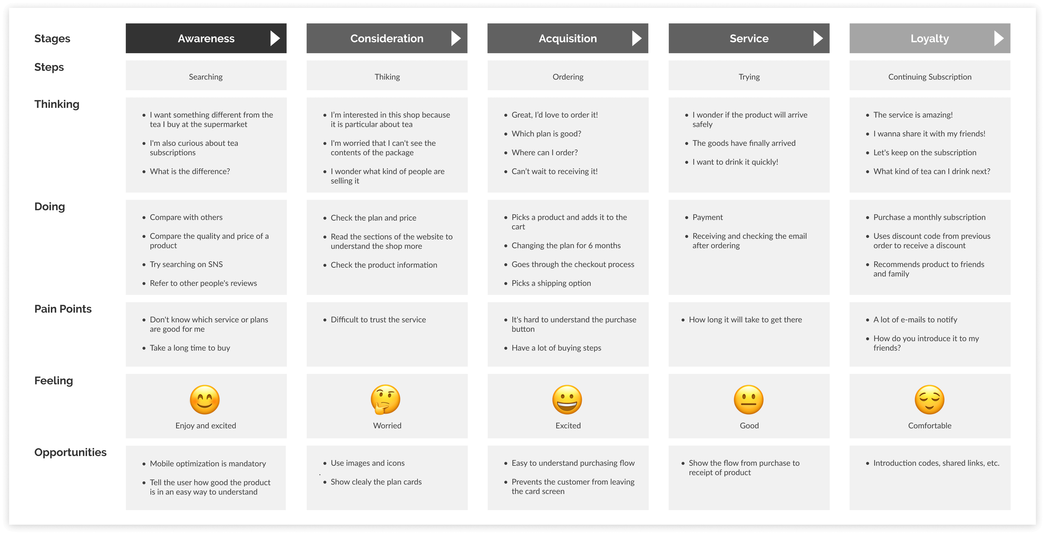
Let’s visualize the user’s tasks!
How can I communicate with users through the site?
To think about it and consider the entire customer experience their feelings, questions, and needs while they interact by using the user journey map.
“What is the deciding factor in choosing us compared to the competition?”
“Can the user have a good experience from being interested to get the product without stress?”
Structure
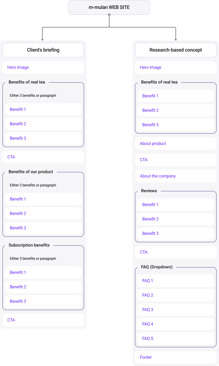
Make the structure of the client’s briefing and Research-based concept for the landing page to understand which content you need there.
Designing
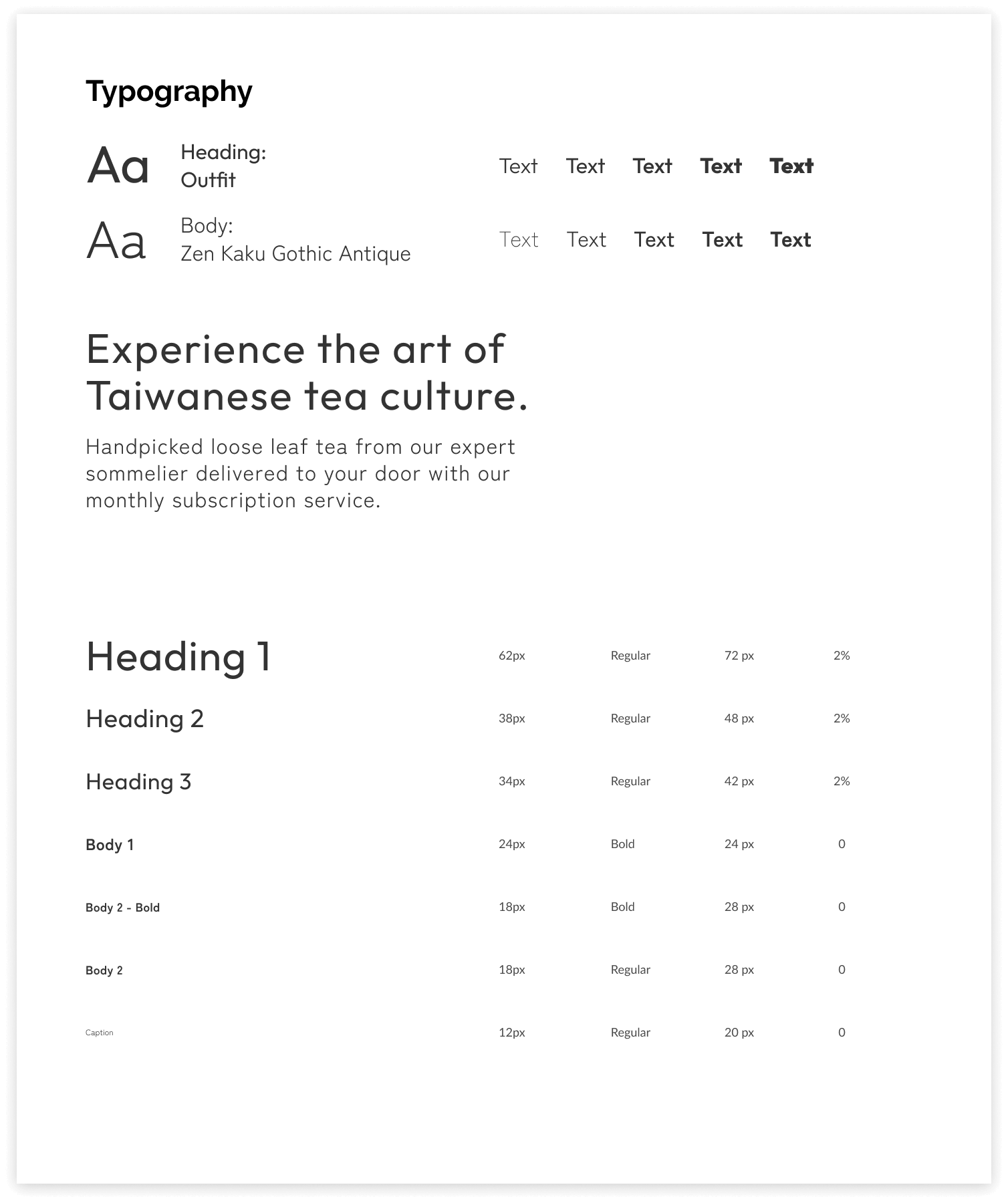
Typography
The title, “Traditional Sans serif” is the same as the one used in the logo. For the text, “Geometric Sans serif” is a good collaboration with the title’s typeface.
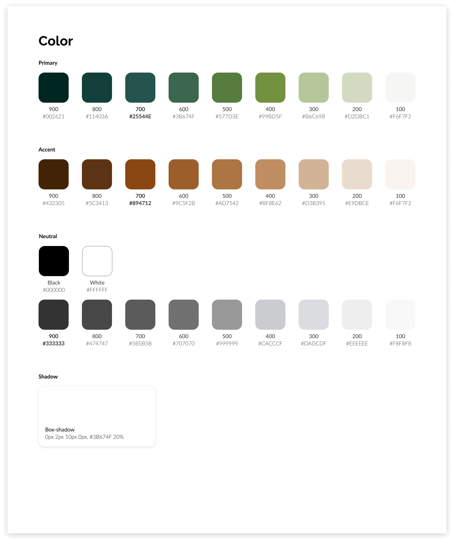
Color
Based on the research by Brainstorming, it uses green reminiscent of tea, and brown reminiscent of the unique colors of Asian pottery.
Icons
A combination of background photos and simple icons for visibility without compromising the design tone.
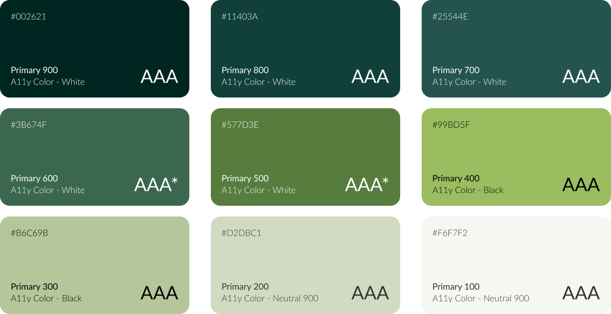
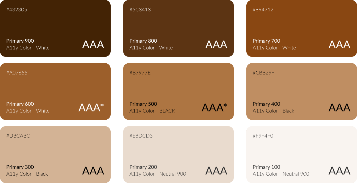
Accessibility
A11y Color Validation
In order to create an online store using a platform called Shopify, so this time I try to enhance accessibility related to colors.
Create a color palette using colors that meet the accessibility contrast requirements. AAA in some colors only fills large text and can be used if the text is 18px or higher.
Primary
Accent
Making the audit by Success Criteria
- 1.4.1. Color is not used as the only visual means of conveying info – Level A
- 1.4.3. The text has enough contrast with the background (contrast ratio 4:5:1 for small text and 3:1 for large text) – Level AA
- 1.4.11. Visual objects must have a contrast ratio of 3:1 against adjacent color(s) – Level AA
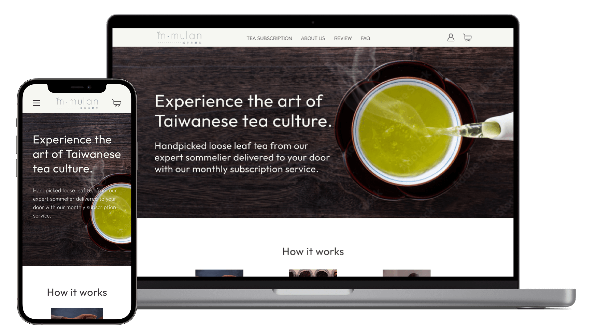
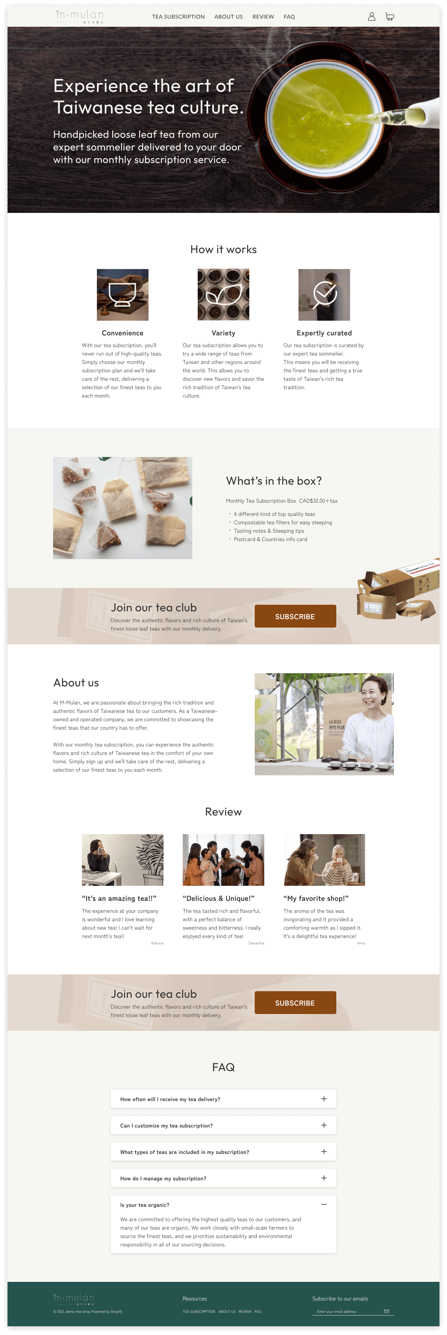
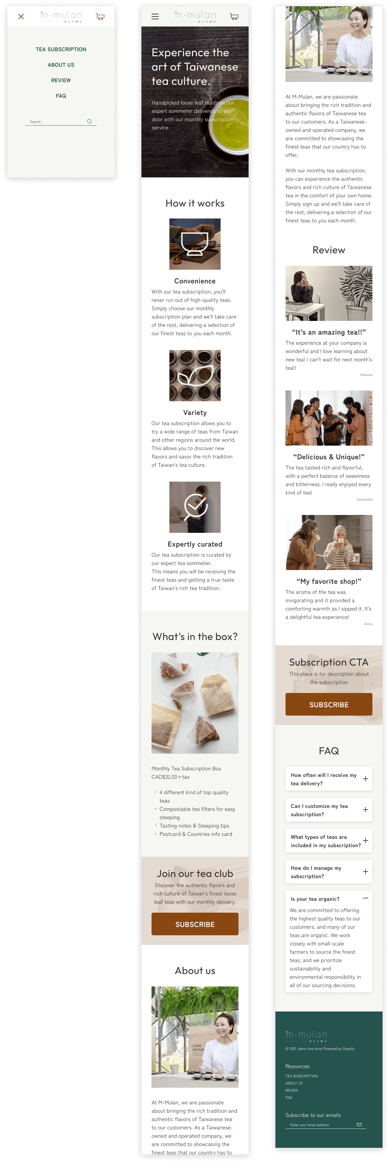
Final Design
Desktop
Mobile
Learnings
Difficult to make a schedule for a user interview
I planned to conduct user interviews with 6 people, but as a result of the cancellation and rescheduling before the meeting, ended up interviewing 4 people. I realized once again that scheduling requires planning, and patience in our limited time.
Enhancing accessibility
Considering individuals such as low vision or color blindness, It is important aware of the high contrast between text and background. In addition to improving color contrast, we also discussed adding alternative text for images through collaboration with developers. Using a platform with limited operations, this project was able to improve accessibility to the extent possible.