
Puro Taglio
Project live at
Developing now
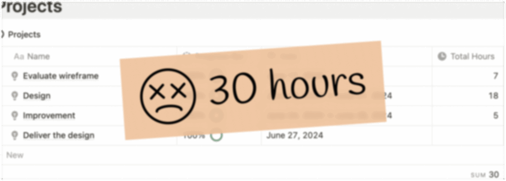
Duration
30 hours in June for the UI design phase
Team
UX/UI Designer
Developer
(Matheus Franceschini)
Overview
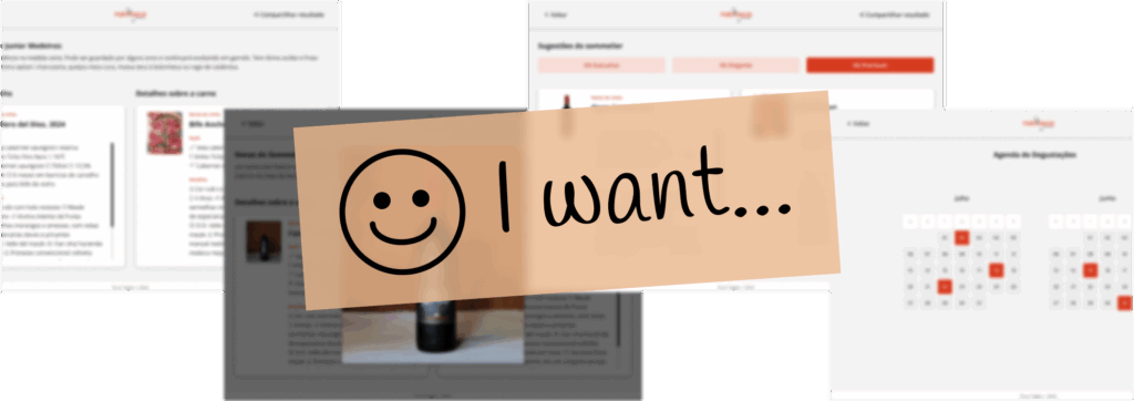
The objective of this project was to create an internal application for a luxury butcher store in Brazil, enabling staff to efficiently view and manage the selection of wine and meat. This was a new product aimed at streamlining internal processes and improving staff efficiency. The store prides itself on offering high-end products, and the application needed to reflect this standard of excellence while enhancing operational functionality.

As the UX/UI Designer, I was responsible for creating a functional and aesthetically pleasing user interface and ensuring an accessible user experience. I collaborated closely with the developer to bring the design to life and ensure seamless integration. My tasks included improving the current wireframe and creating high-fidelity prototypes.
Goals
- The main goal was to provide a simple, intuitive iPad application that showcases the harmonization between wine and meat.
- The application aimed to help store staff quickly access detailed information about the products, including pairing suggestions, availability, and event schedules.
UI Design for the tight deadline
The project started in June and our team had to deliver the product by the end of August, which required a streamlined and efficient design process.
To meet the tight deadline, the process emphasizes rapid iteration and focuses on delivering minimum but essential functions.
This approach allowed us to quickly validate ideas, make necessary adjustments, and ensure we stayed on track for the less than 2-month deadline including design and development.
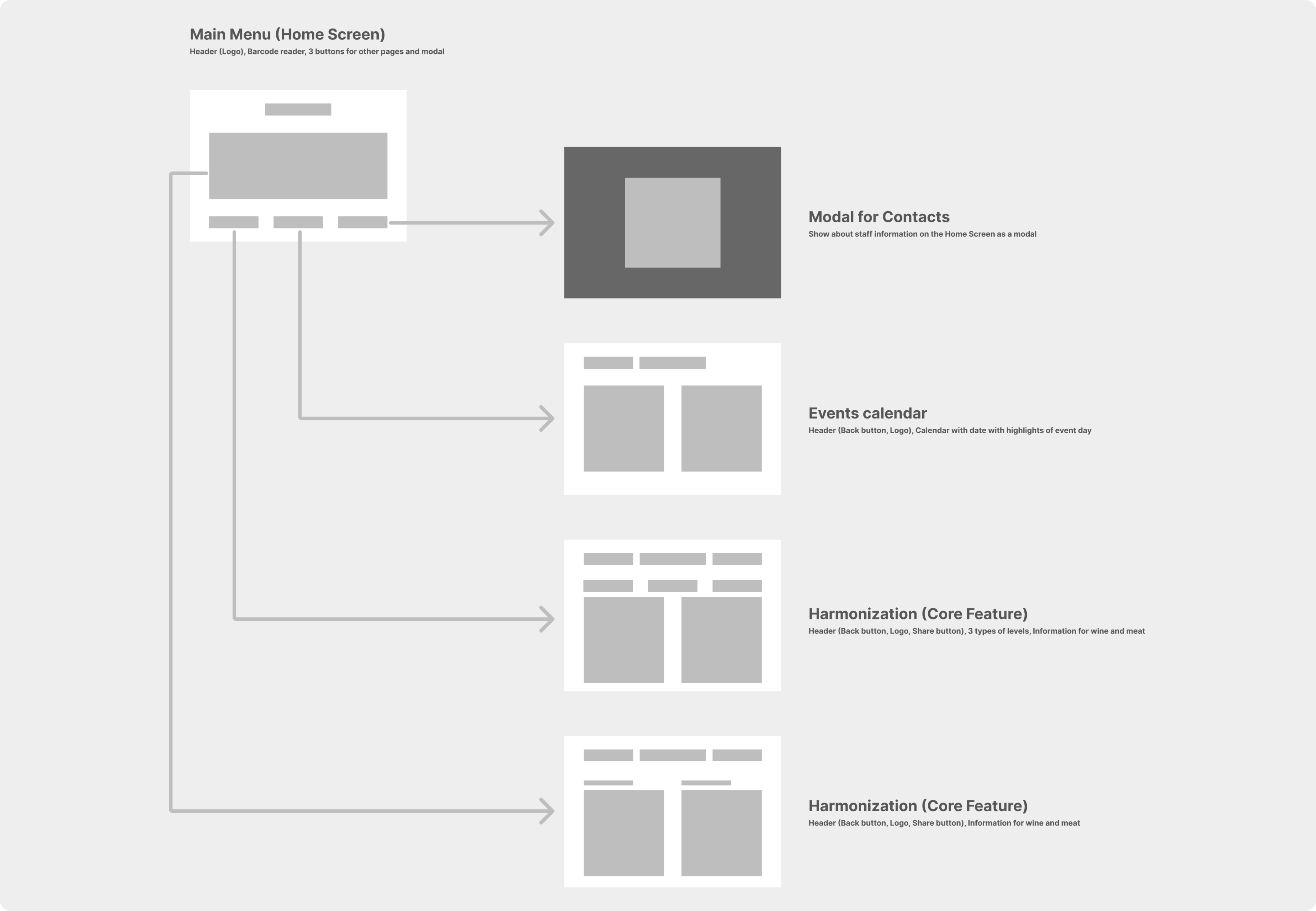
Understand clear basic components
The first step involved improving the existing wireframes to understand the basic components required for the user interface. Previous wireframes had focused on navigation but lacked clarity in UI components. I developed new wireframes that defined clear, basic components necessary for building a functional and accessible UI.
I designed rough wireframes to map out the application’s structure and user flow. These wireframes focused on essential screens such as the home dashboard, product pairings, and product suggestions.
Focused on essential functions
The prototypes featured:
- A filterable product suggestion according to the 3 types of levels.
- Detailed product pages with images, descriptions, and pairing suggestions.
- An intuitive navigation system designed for quick access and ease of use.
- A sophisticated color palette and elegant typography align with the store’s luxury branding.
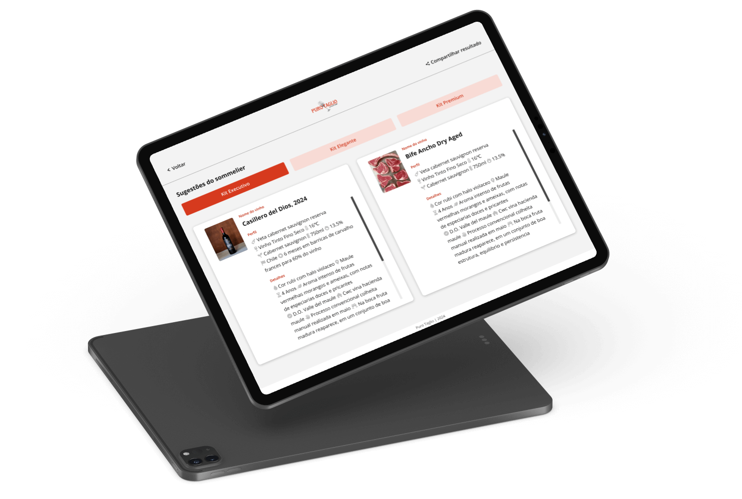
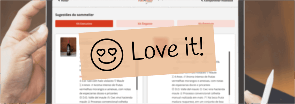
A filterable product suggestion
During the UI phase, one of the key features I designed was a filterable product suggestion tab. This feature aimed to help staff easily find wine and meat pairings based on three different price levels: Executive, Elegante, and Premium.
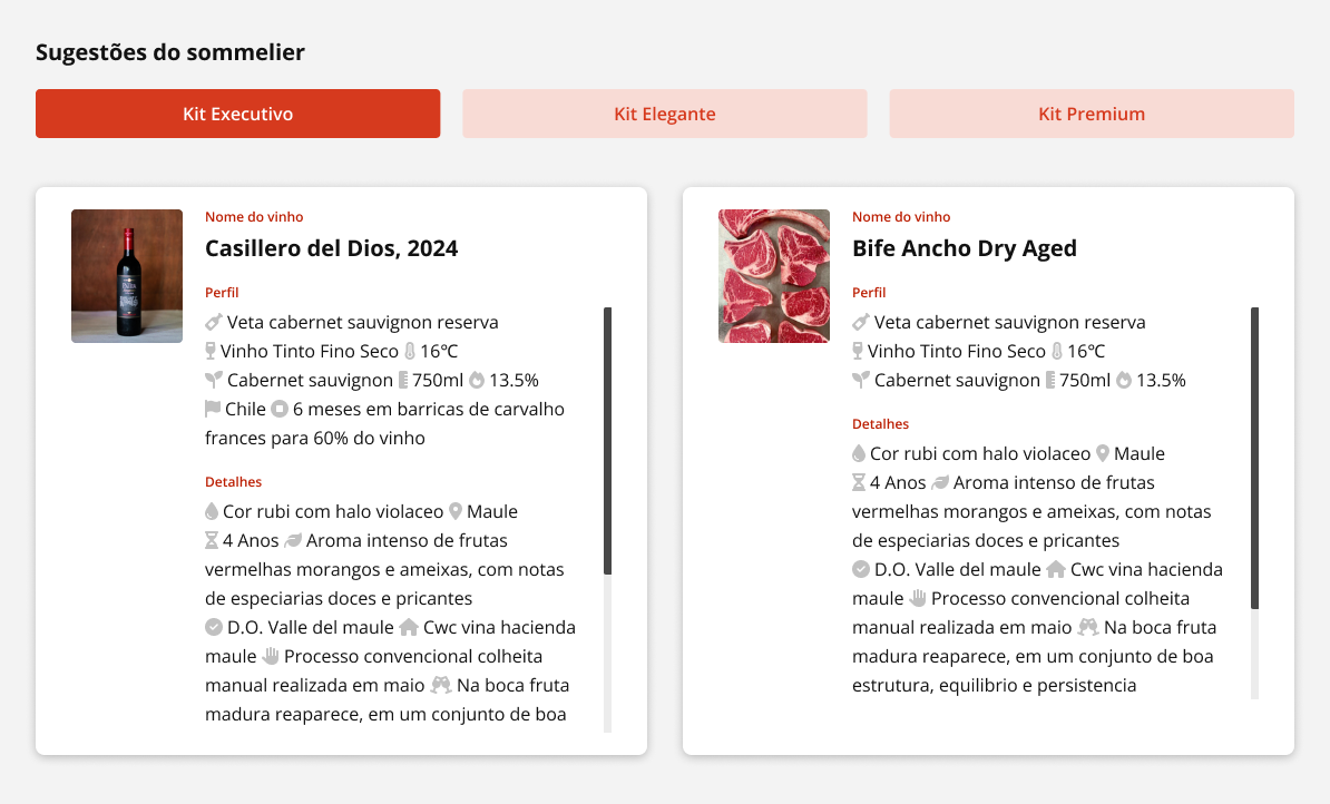
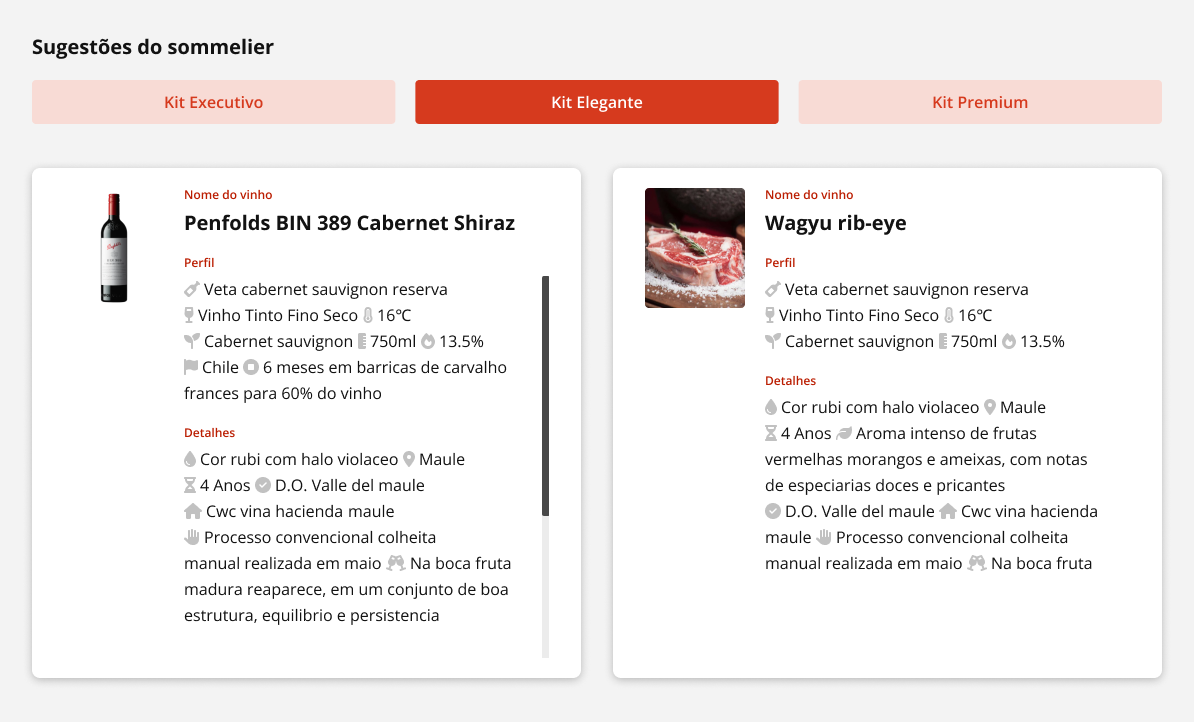
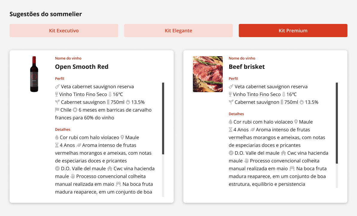
By categorizing suggestions into three price levels, staff could efficiently match products to customer preferences and budget constraints.
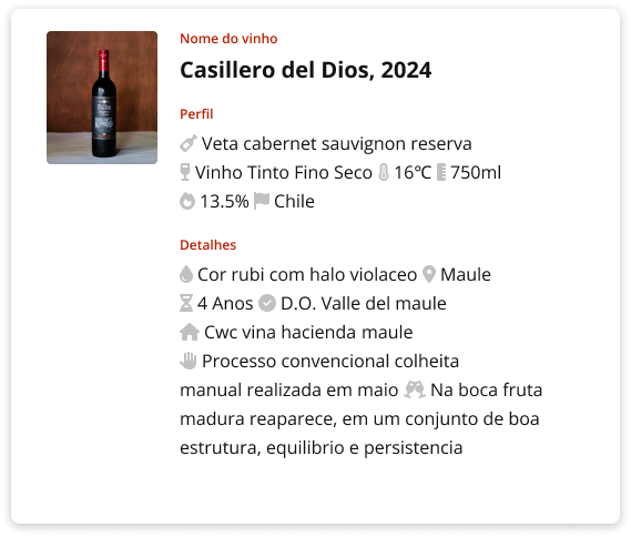
Card design for clarity and appeal
Each product detail is presented on a separate card to highlight and clearly separate the information. Cards are used to segment different types of content, such as product images, descriptions, and pairing suggestions, making it easier for users to locate specific information quickly.
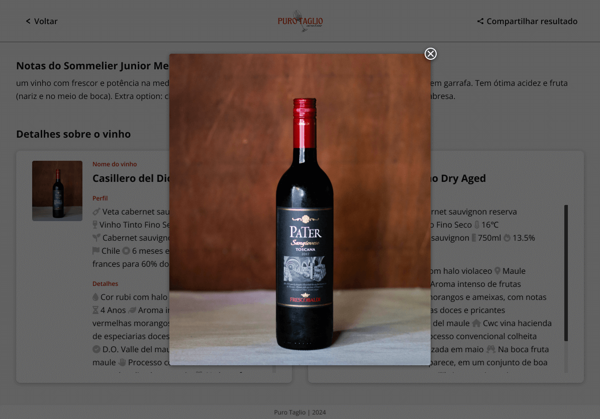
Each image was clickable, allowing it to be displayed larger in a modal. This feature enabled staff to view products in greater detail when needed.
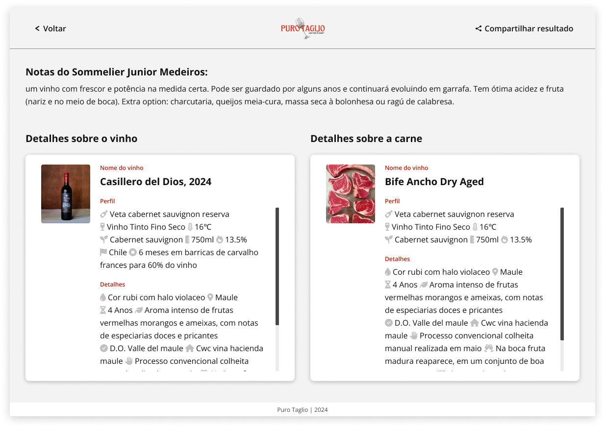
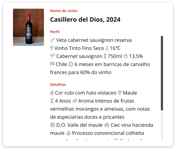
To improve the visual hierarchy and readability, I used box shadows for each card, adding depth and contrast to help the elements stand out against the background.
Additionally, if the content exceeded the card’s height, a scroll bar appeared, allowing users to scroll within the card, ensuring all information was accessible without cluttering the initial view and maintaining a clean, organized layout.
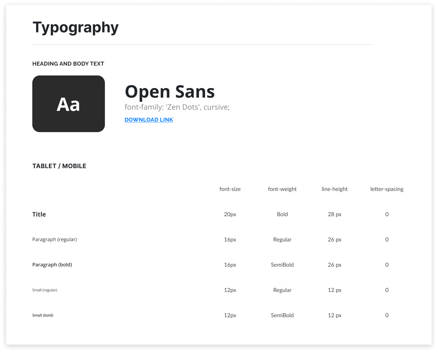
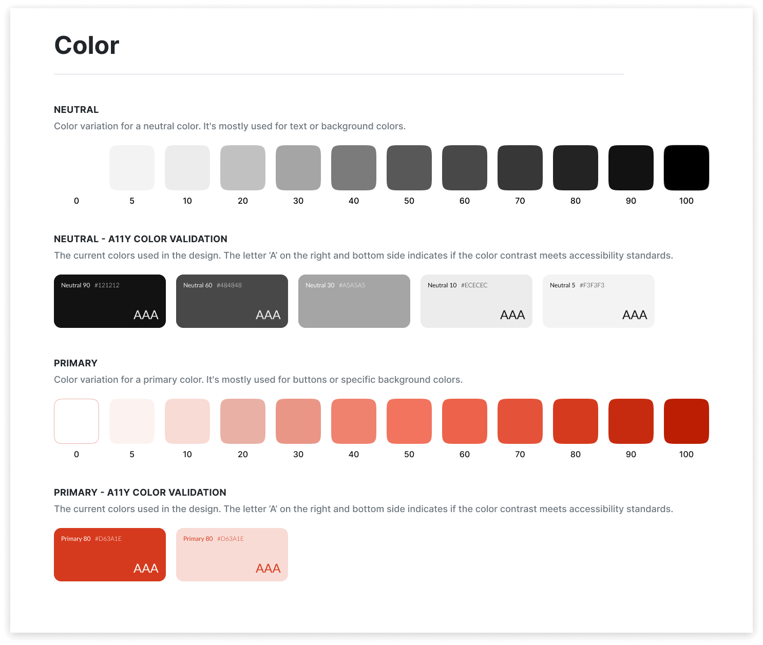
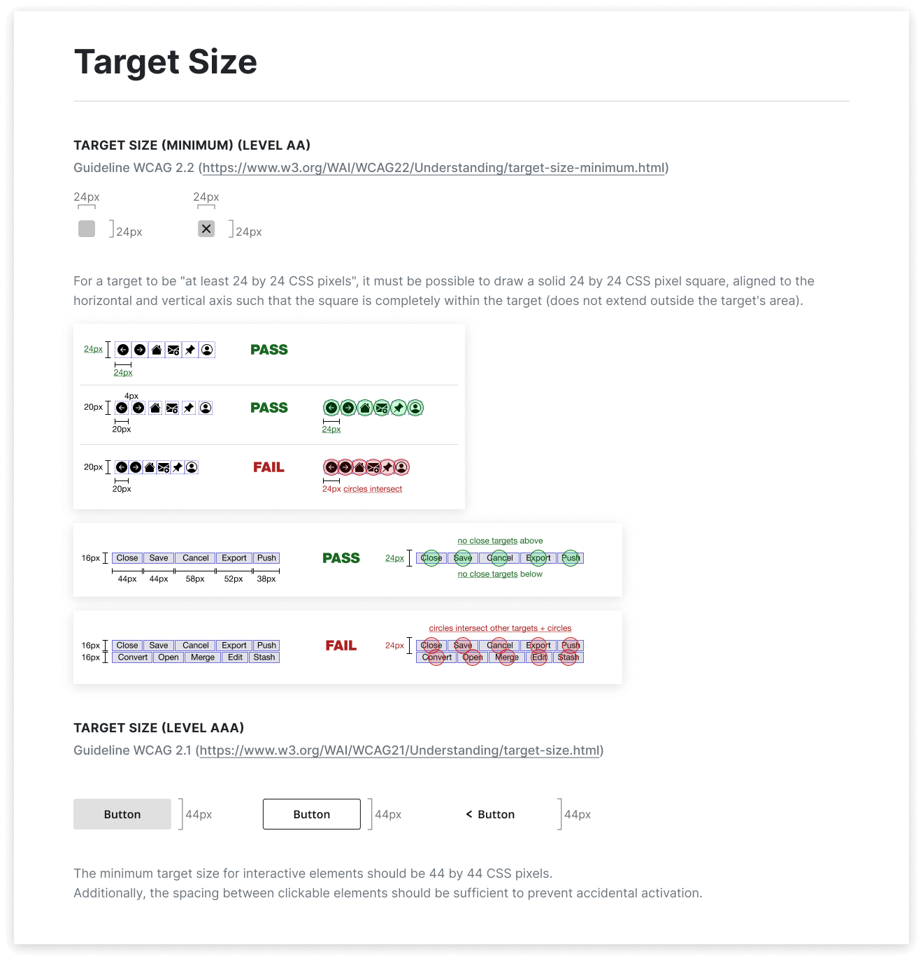
Style Guide
The style guide is designed to provide clear and consistent guidelines for future teams, ensuring the application maintains a high standard of usability and accessibility. The guide includes detailed specifications for typography, color schemes, and target sizes, adhering to WCAG 2.2 AA and AAA standards.
Final Design
The application significantly improved the efficiency of the store staff, enabling them to provide better service to customers. The intuitive design and accessible interface allowed staff to quickly find and present product information, enhancing the overall customer experience.