
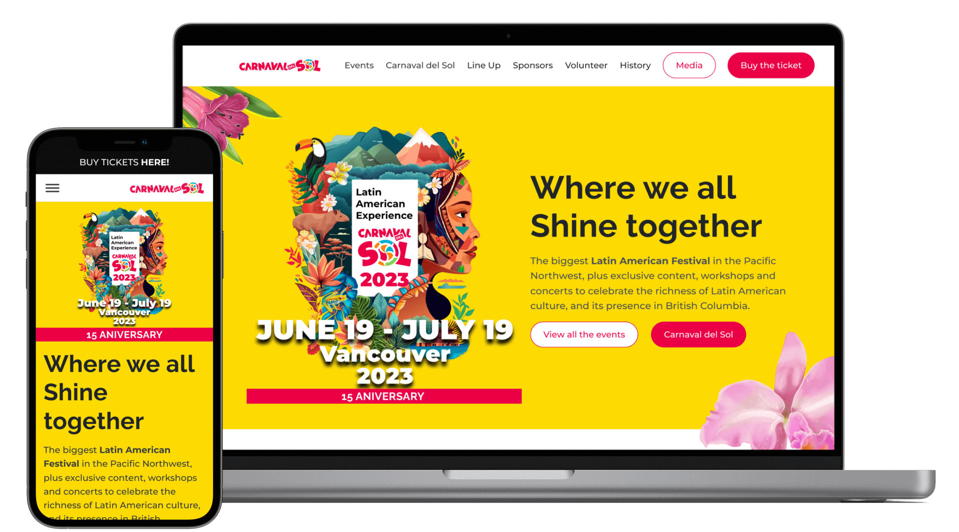
Carnaval del Sol
My roles
UX Designer
My tasks
User testing
Information Architecture
Low-fidelity prototyping
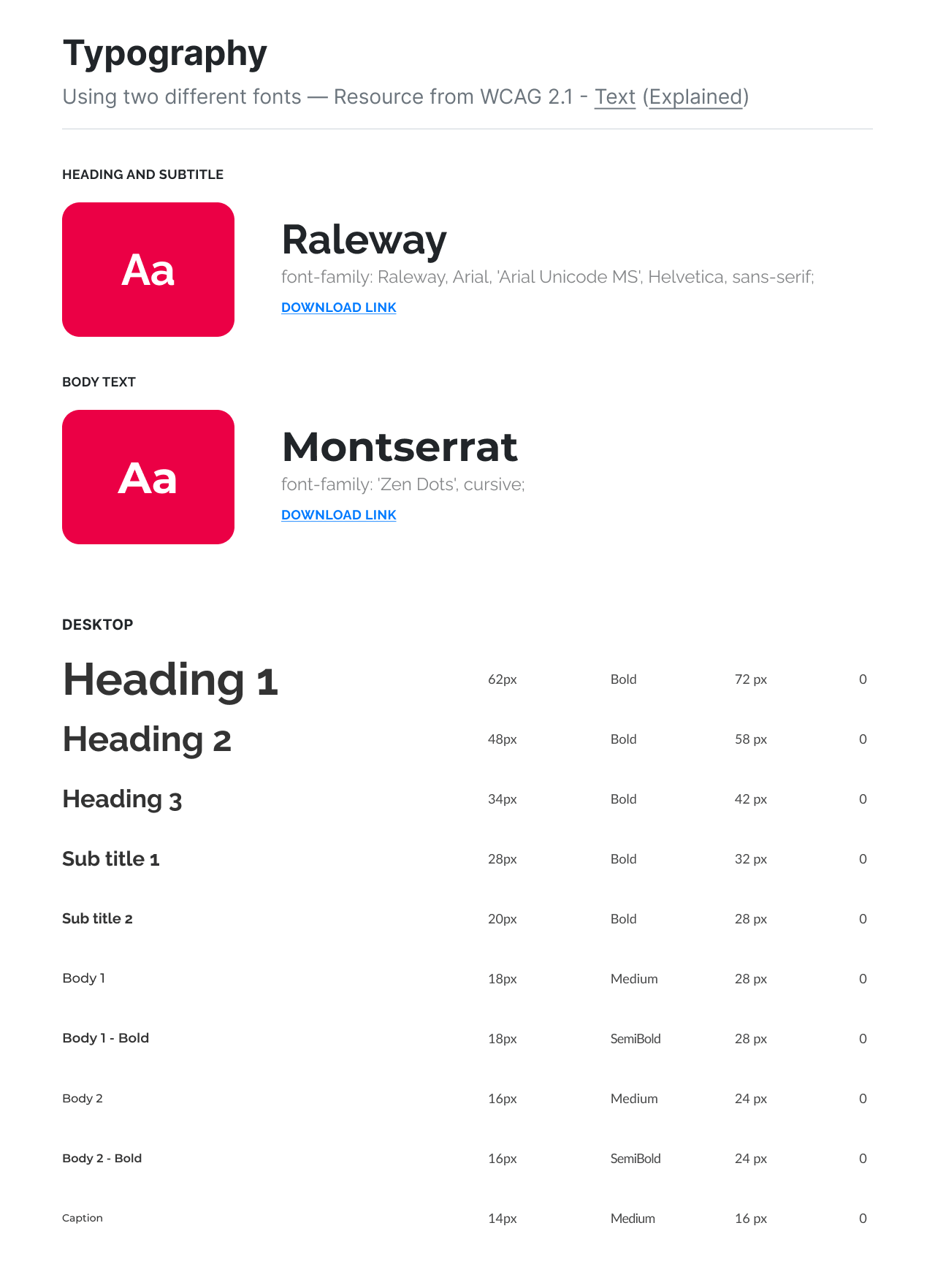
Basic UI Guideline
Project live at
Overview
Collaborate with a UX designer and a design agency to design the website for a large festival in Vancouver. *Showing case details only of what I did.
As a member of the Latincouver, I joined the “Carnaval del Sol” project the biggest Latin American Festival in the Pacific Northwest with 15 years of history.
Latincouver is a non-profit organization in Canada that brings together both Latin Americans and Latin enthusiasts living in BC, Canada.
Goals
- Organize a variety of events and different levels of information indexing the information in an adequate way for heterogeneous users.
- Wants to make a template the organization can use next year as well.
Because they have had no backup of their designs in the past 15 years, so they needed to make new designs every single time.
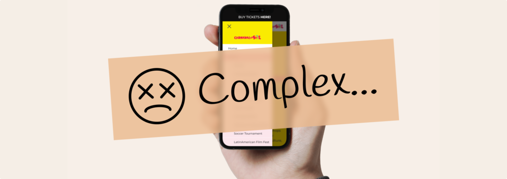
Problem
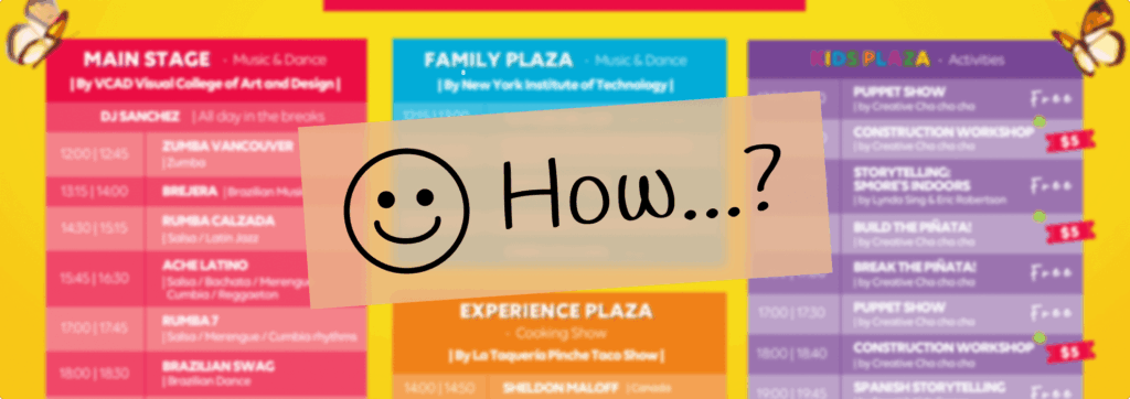
How can we correctly guide each user through about 20+ events?
In the 15th-anniversary celebration of this annual event, we decided to redesign the website. Many designers have collaborated on this throughout the years without an efficient documentation process.
Complex contents
The one-month event has increased its popularity in Vancouver, increasing the number of attractions every year. At the beginning of the project, there were at least 10 big and more than 10 small attractions, which were expected to increase in the future. It was a big challenge to organize different levels of information for all of them, which were indexed by dates.
Designing for user engagement
Crafting a user-friendly mobile experience for registrations posed a challenge. With most users accessing via mobile, ensuring responsiveness and ease of use was crucial for effective engagement and conversion.
Embracing Mobile-First Design
In preparation for an event overview, I engaged with stakeholders overseeing various attractions. Research findings unveiled crucial insights:
Over 80% of our audience accessed the website via mobile devices
The principal age group among visitors ranged from 25 to 34
Initially, the client and design agency leaned towards traditional desktop design, citing comfort in their 15-year history. However, armed with contemporary insights, we recognized the need to prioritize user experience. To chart the best course, I convened a stakeholder meeting to deliberate on adopting either a desktop-centric or mobile-first design strategy.
The audience is data-sensitive
Data sensitivity emerged as a crucial consideration when conducting user testing and stakeholder interviews for past websites. The absence of clear scheduling information stemmed from challenges in organizing diverse data levels and connecting uncertain information, revealing the complexity of the task.
Understand research results through the journey map
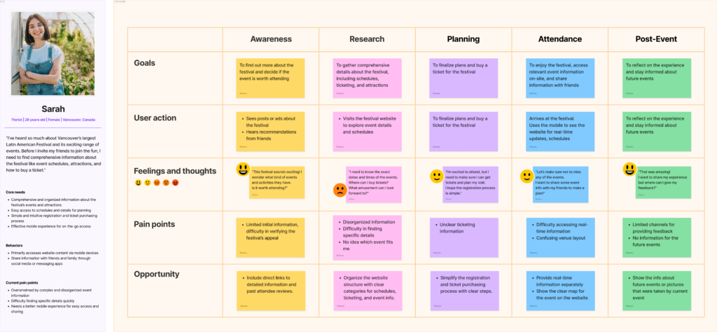
The key points are…
Mobile user engagement:
With most users on mobile, a user-friendly experience was crucial, including easy registration and real-time updates.
Managing complex content:
The festival’s growing popularity led to an increase in attractions, making it challenging to organize and index information for a diverse audience.
Efficient information organization:
Clear categories for schedules, ticketing, and attractions on the website made it easier for users to find details.

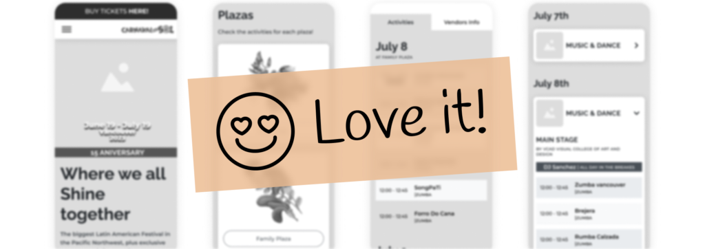
① Building IA while more attractions coming
So, first of all, using the Affinity Map to organize the event’s details and collect the contents by Information Architecture. Also, tried to visualize what each department is thinking and wants (the flow to ticket purchase and the information required for each event page, etc.) and match the recognition among stakeholders.
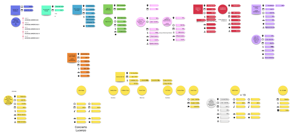
This allows us to share the information that has been in their head so far with everyone, and to understand which information is uncertain or undecided. In particular, although a lot of information was certainly uncertain on the event page, I noticed that many of the structures listed were the same and could be grouped into several groups.
② Consistent components to organize multiple events
I developed consistent components to streamline the design of the entire interface. This approach aids developers by promoting efficiency, reducing redundancy, and accelerating the development cycle. Additionally, it facilitates more effective collaboration among teams, ensuring a unified vision across the system.
For users, the benefit of consistent components is clear: they can easily understand how to interact with them, thereby minimizing confusion and enhancing usability.
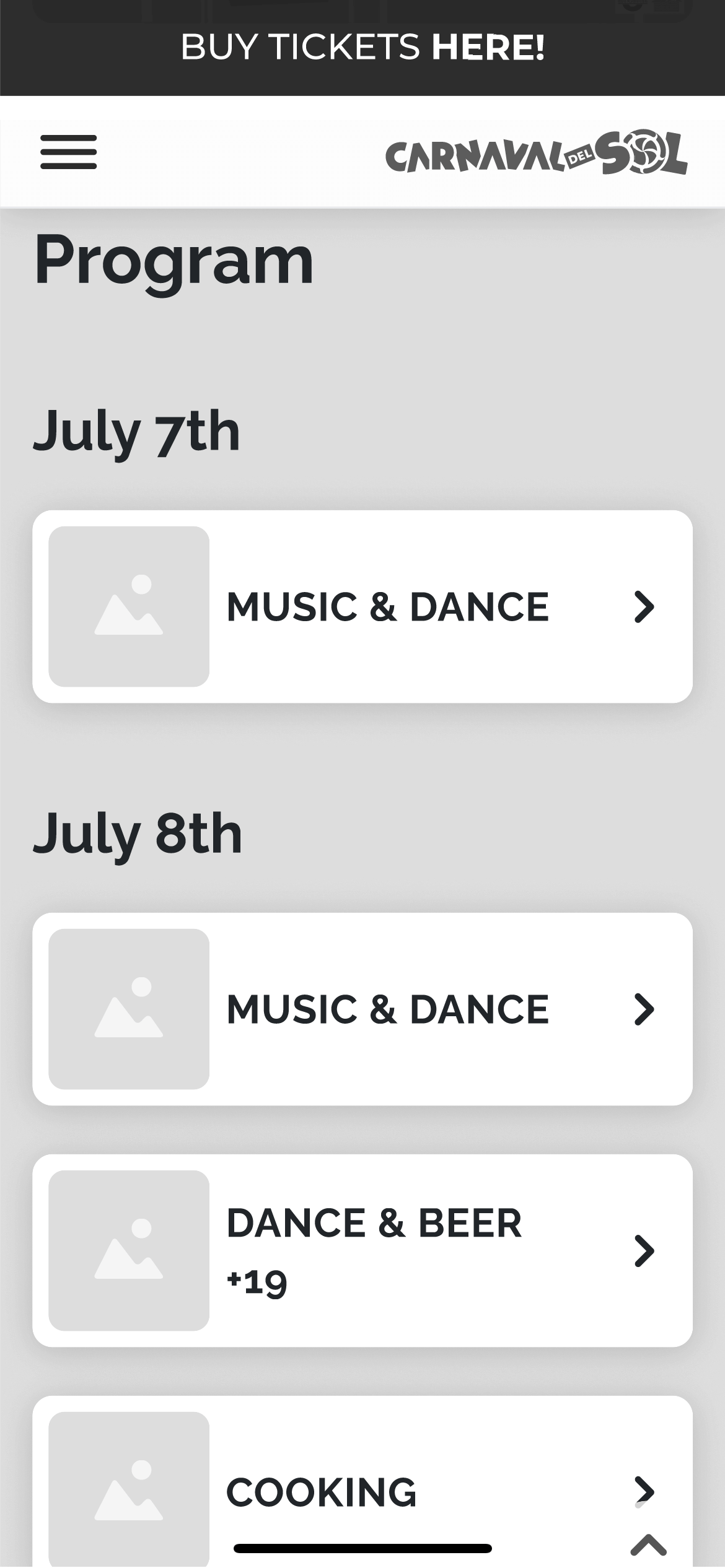
Grouping card components
Use card components to improve content navigation and create a user-friendly interface that looks good and works well.
- Visual Hierarchy and Organization:
Implement visual tiers to organize related content, aiding users in understanding the relationship between different cards and facilitating efficient content discovery. - Mobile-Friendly Design:
Ensure that card components adapt well to mobile devices, stacking vertically on smaller screens for seamless content browsing through easy scrolling. - Reusability:
Employ scheduling components across various sections to establish a flexible system capable of accommodating information updates and changes.
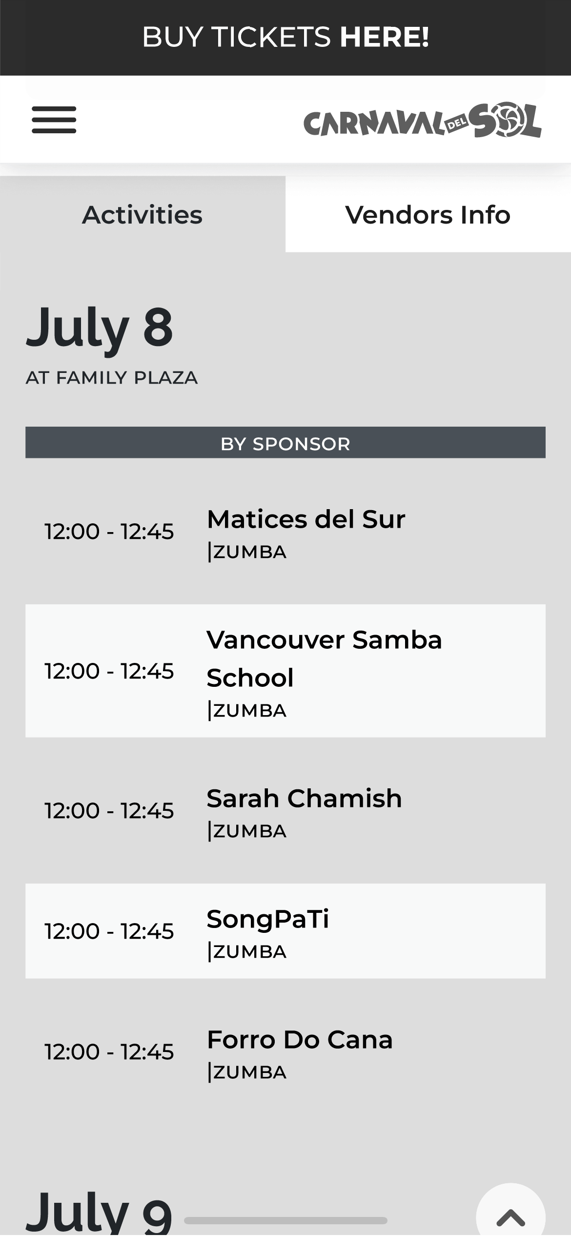
Tabs
Using tabs to allow users to switch between different sections with a simple tap or swipe gesture, enhances mobile usability.
- Flexibility and Scalability:
Tab components are highly flexible and scalable, tabs can be easily extended or modified without significantly impacting the overall structure or layout of the interface. - Clear Navigation:
Switch between tabs to access the desired information without the need for excessive scrolling or searching for users can quickly understand the available options. - Content Organization:
Organize and present content to reduce clutter and improve the overall organization of information.
③ Using the filter function to guide the users
Making a functionality that people answer 5 questions, the system will use the answers to show that events connect the person. Use the filter function to display the suitable events for the selected answers. The system gives users energetic comments for the event, so the users can enjoy the activity test.
The purpose of this filter function is to guide users to the correct events. By incorporating filters effectively, you can empower users, streamline content exploration, and enhance overall usability and satisfaction.
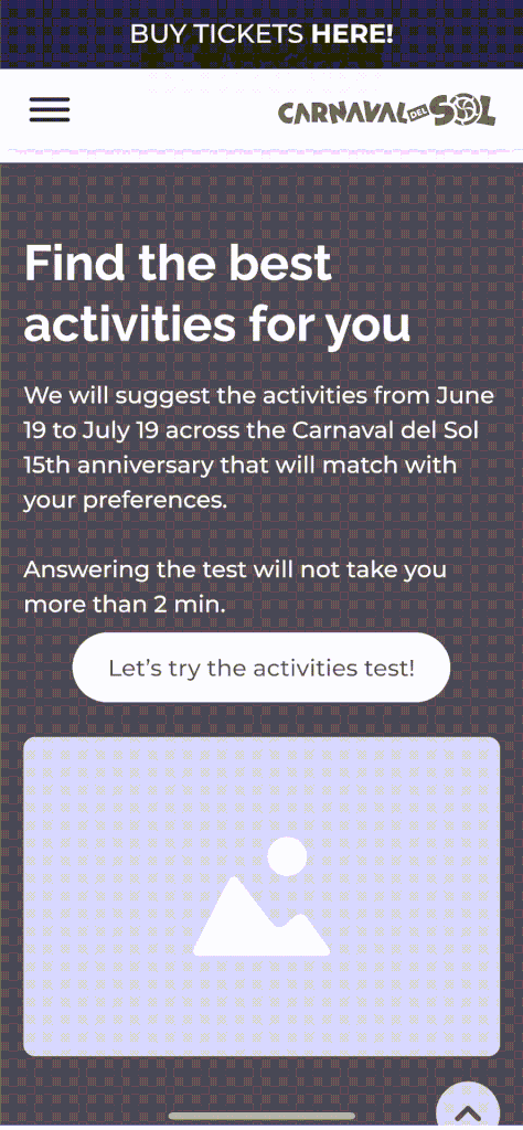
- Improved Content Discovery:
Filters enable users to refine and narrow down the displayed content based on their specific preferences or criteria. Users can quickly find the relevant information which matches them. - Time-saving and Efficiency:
Searching for vast amounts of information can lead to user detachment or misrecognition. This feature enhances efficiency and improves user satisfaction by providing a more direct and focused path to the desired information. - Analytics and Insights:
The usage of filters can provide valuable analytics and insights into user behavior and preferences.
These insights (Age, Interest, Email, etc.) will be shared with the marketing team to help them in the future.
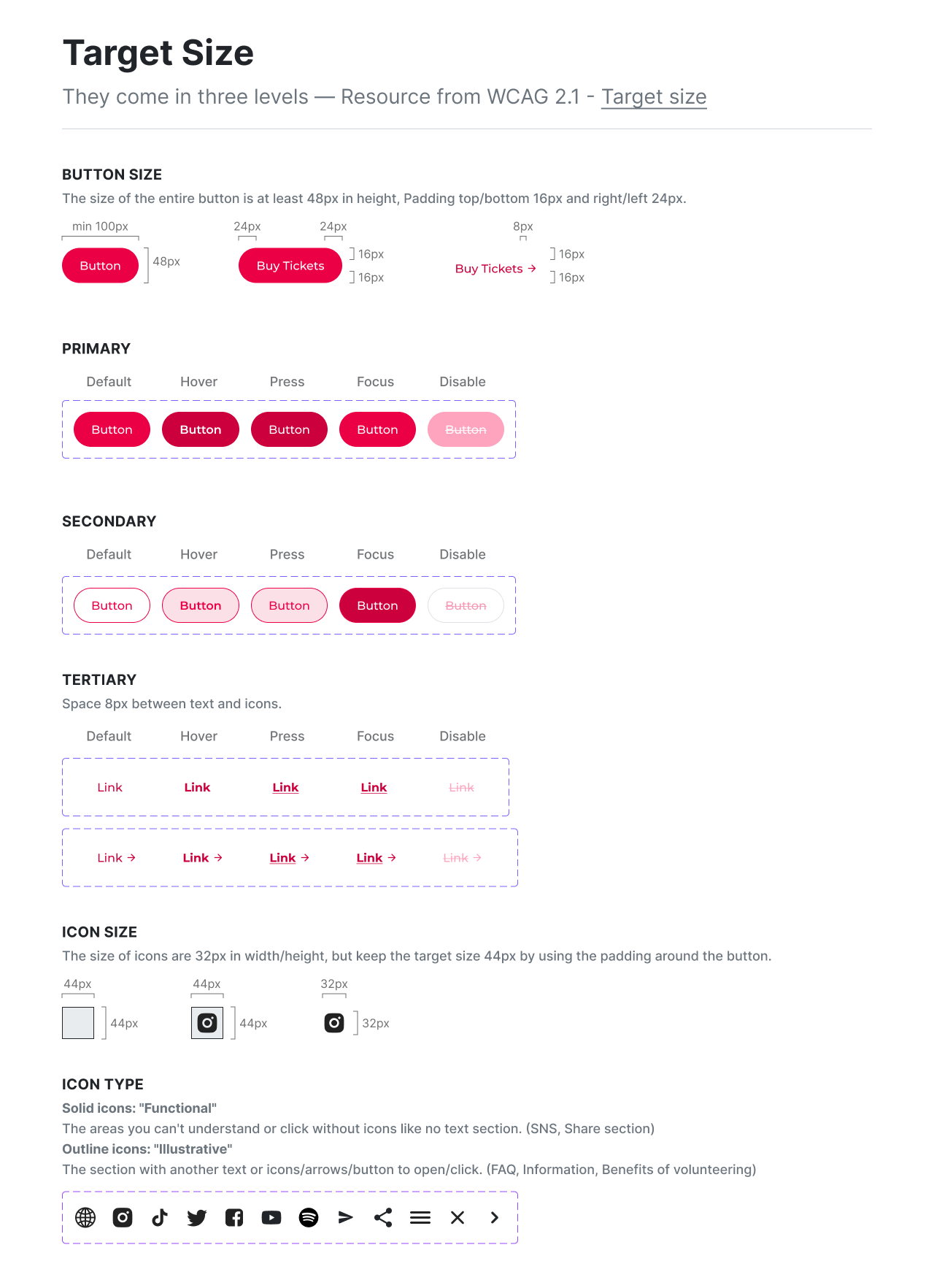
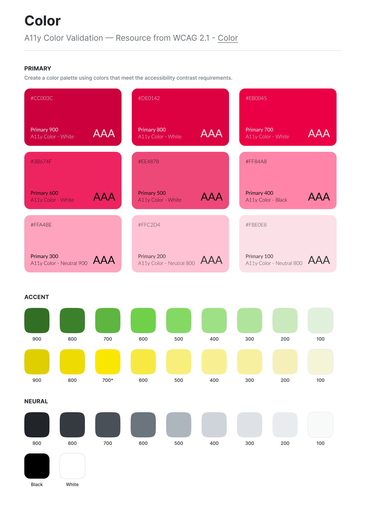
This is the infrastructure for the long-term website. It was a big improvement in the target size to make clickable spaces and create a color palette using colors that meet the Accessibility(WCAG 2.1) contrast requirements.
When we started working on the project, the problem we had was that we didn’t have any design data from the past. In the past, designers did not know how they thought and decided on the design decision, so the work was difficult.
So I made a basic design system and used Figma Components, Auto Layout, and Variant to make/organize a basic design system that the design agency and other future designers can use.
Deliver wireframes
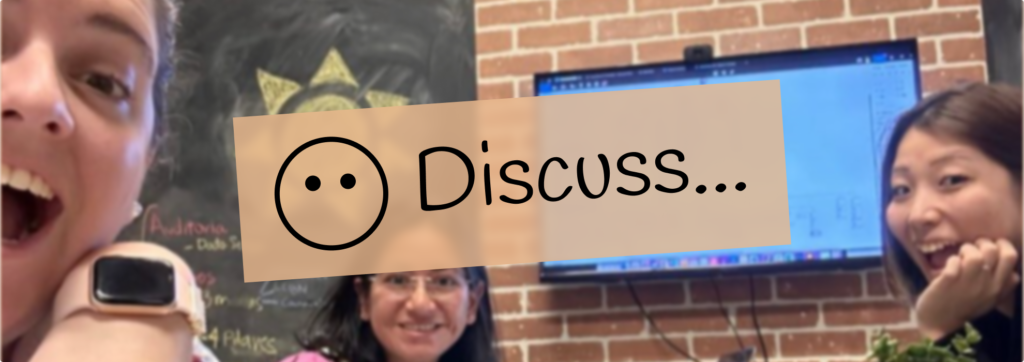
I was responsible for conducting research and delivering wireframes. Following this process, the design agency utilized the wireframes and the basic design system to develop the final user interface. To ensure clarity and continuity, another UX designer and I created a document for presentation to the design agency and stakeholders, outlining our work and detailing how it could be utilized both presently and in the future.
👇 Interact with the prototype below
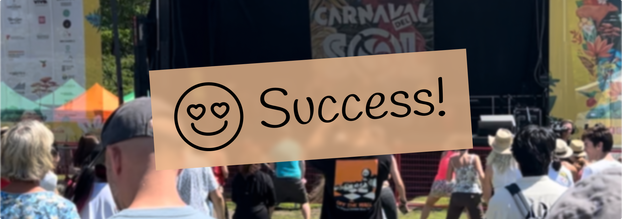
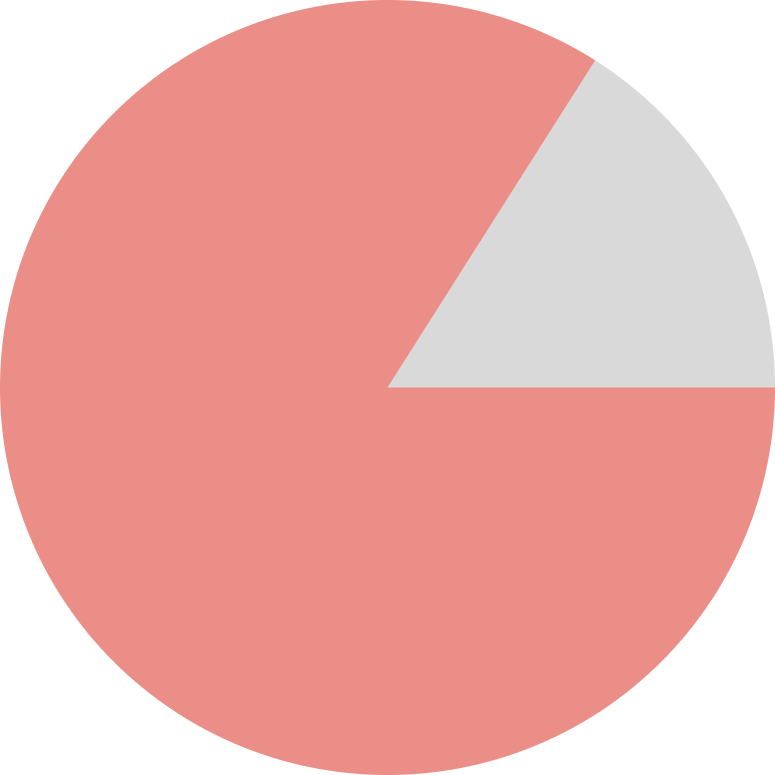
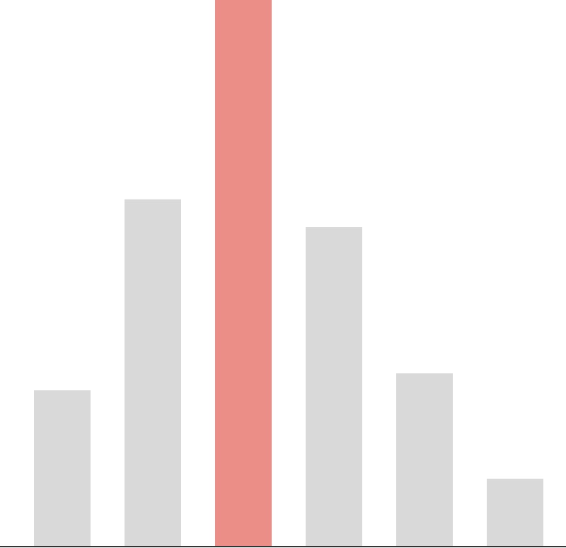
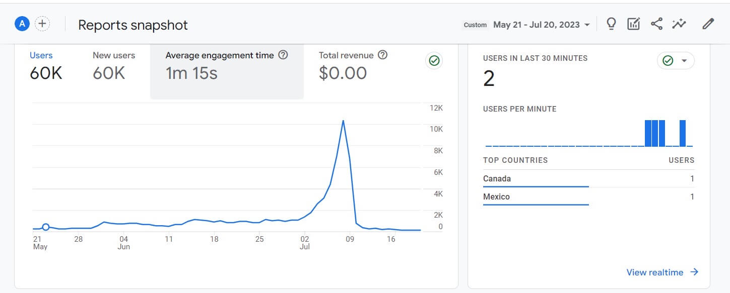
As a result, 23% sales increase
Sales went up by 23% from last year, showing that the better website design helped turn more visitors into customers. The redesign made the website more appealing, which brought in more people and boosted sales. This proves that investing in improving user experience was a smart move for the company.
Learnings
A solid structure doesn’t need to be affected when event details change
During the design process, the content changed a lot but it didn’t change the elements were done because I organized the UI with reusable components. My experience at a startup company’s rapid work helped a lot at this point.
Organization’s recognition
It was quite hard work collaborating with other departments and the design agency. Trying to know what they wanted/needed was a good practice. I could communicate well with members of the Latincouver while doing interviews. They gave me an award “Monthly MVP” for our best work and dedication of the month.